


Table of Contents
Quick Summary
- Looking ahead to 2026, interior colour trends for indian homes are shifting towards warmer, more comfortable, and personalised palettes.
- Explains why warm neutrals such as beige, greige, cream, and taupe are replacing stark white walls.
- Discusses the growing popularity of earthy shades including terracotta, clay, ochre, and stone grey.
- Highlights mature green tones like sage, olive, and eucalyptus for calm and nature-inspired interiors.
- Covers the use of jewel tones such as emerald, plum, and deep blue for feature walls and accents.
- Explores sophisticated pastel shades that brighten rooms without appearing overly playful.
- Shares practical tips for selecting colours based on lighting, furniture, flooring, and room function.
Interior colour choices are becoming more personal, more grounded, and more expressive in Indian homes. Homeowners are no longer choosing wall paint shades only because they look good in a catalogue. They want colours that feel comfortable through long summers, suit natural Indian light, match wooden furniture, and create a home that feels warm without looking heavy.
This article explores key 2026 colour trends and how they can refresh Indian homes beautifully.
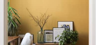
Warm Neutrals Are Replacing Flat Whites

Indian homes often need colours that reflect light without making the room feel plain. That is why warm neutrals are expected to remain highly popular in 2026. Shades like cream, almond, sand, beige, greige, and soft taupe create a clean base while still adding warmth.
These colours work well in:
- Living rooms with wooden or cane furniture
- Bedrooms that need a calm look
- Compact apartments that need an open feel
- Homes with marble, granite, or vitrified flooring
The key is to avoid overly cold whites. A warmer neutral gives the walls a softer appearance and pairs beautifully with brass, rattan, terracotta decor, indoor plants, and Indian textiles.
Earthy Shades Will Bring a Natural Feel

Earth-inspired colours are becoming a strong choice for Indian interiors. Terracotta, clay, muted brown, stone grey, burnt peach, and soft ochre bring a grounded, lived-in feel to a space. These shades work especially well in homes that use natural materials, handcrafted decor, wooden furniture, woven textures, warm lighting, and neatly finished surfaces with enamel paint.
These colours work well in:
- Dining spaces that need a warm and inviting mood
- Bedrooms where you want a restful yet stylish look
- Study rooms that need depth and focus
- Living rooms with plants, cane furniture, terracotta decor, or earthy soft furnishings
A terracotta accent wall can make a dining area feel welcoming, while a clay-toned bedroom can look calm without feeling dull. These colours also sit well with Indian sunlight, which can make very bright shades appear sharper than expected.
Greens Will Stay Calm and Mature

Green is moving away from loud, fresh shades and toward a more refined palette. Olive, sage, eucalyptus, moss, and dusty green are expected to be preferred for homes that need a peaceful, nature-connected mood.
These colours suit:
- Bedrooms where calmness matters
- Reading corners and work areas
- Balcony-facing rooms
- Dining spaces with plants and wooden furniture
Green also works well with cream, off-white, walnut, tan, and dull gold. For a more polished look, use green on one main wall and keep the surrounding walls neutral.
Jewel Tones Will Add Character

Indian homes have always welcomed rich colour through fabrics, art, rugs, and festive decor. In 2026, jewel tones will continue to appear in more controlled and elegant ways. Deep blue, plum, emerald, wine, and aubergine can make a room look expressive without feeling crowded when used carefully.
These colours work well in:
- Living rooms with a feature wall behind the sofa
- Dining areas that need a richer, more elegant look
- Passage walls, niches, or panels that need visual depth
- Bedrooms where deeper shades are balanced with soft lighting
A deep blue wall, a plum-toned niche, or an emerald panel can create impact. Pair these shades with muted flooring, warm lights, and soft furnishings so the colour feels stylish rather than overpowering.
Soft Pastels Will Look More Grown-up

Pastels are not going away, but they are becoming less sugary and more sophisticated. Dusty rose, powder blue, muted lavender, pale peach, and soft mint can brighten Indian homes while keeping the look gentle.
These shades are useful for:
- Children’s rooms should not feel too loud
- Guest bedrooms
- Small bedrooms with limited natural light
- Corners used for prayer, reading, or relaxation
The most important point is the undertone. A pastel with a grey, beige, or warm undertone usually looks more elegant than a very bright pastel.
Final Thoughts
The colour trends for Indian homes in 2026 are warm, personal, and easy to live with. Instead of choosing colours only because they are popular, homeowners should look at light, room size, furniture, flooring, and daily use. The right paint colour can make a home feel brighter, calmer, richer, or more welcoming. A good painting plan should bring together shade, finish, surface type, and maintenance needs. When chosen well, colour does more than decorate a wall.
Also Read: 10 Interior Painting Ideas for Every Room in Your Home
FAQs – Interior Colour Trends for Indian Homes
1. Which wall colours are trending in Indian homes for 2026?
Warm neutrals, earthy terracotta shades, sage greens, jewel tones, and muted pastels are among the most popular interior colour choices for Indian homes in 2026.
2. Why are warm neutrals replacing white walls?
Warm neutrals create a softer and more welcoming atmosphere while reflecting light effectively. They also pair well with wooden furniture, indoor plants, and natural materials.
3. Are green shades suitable for Indian interiors?
Yes. Shades such as sage, olive, moss, and eucalyptus work well in Indian homes because they create a calming environment and complement natural lighting.
4. Can dark jewel tones be used in small rooms?
Yes. Jewel tones can add depth and character when used on a feature wall and balanced with lighter colours, warm lighting, and simple furnishings.
5. How do I choose the right paint colour for my home?
Consider the room size, natural light, furniture style, flooring material, and daily usage. Testing paint samples before finalising a colour is always recommended.
Author & Expert Review
Written By:  Gaurav Mishra | Civil Engineer & Content Writer
| Credentials: B.E. (Mahavir Swami College, Surat), Registered with Bhagwan Mahavir University (BMU). Experience: Civil Engineer with 5+ years of content writing experience, currently writing impactful articles for Gharpedia, part of SDCPL. Expertise: Specializes in writing well-researched content on residential construction, construction materials, design planning, on-site practices, and safety, blending technical accuracy with everyday clarity. Find him on: LinkedIn |
Verified By Expert:  Farhan Shaikh – Senior Manager – Architect, SDCPL | Associate Member – IIA
This article has been reviewed for architectural and interior design accuracy by Farhan Shaikh, Senior Manager – Architect at Sthapati Designers & Consultants Pvt. Ltd. As the lead for all architectural and interior projects at SDCPL and an Associate Member of the Indian Institute of Architects (IIA), he brings hands-on experience in architectural planning, interior design, project coordination, and sustainable strategies. His review ensures the content reflects practical design considerations, industry best practices, and real-world applicability across both architecture and interior spaces.
Find him on : LinkedIn